BESST Drinks
STEP 1: USER PERSONAS AND COMPETITOR RESEARCH
BESST Drinks are healthy, herbal alternatives to soft drinks that can refresh and energize without artificial colorants and flavors. The brand's main target consists of a younger demographic, people who are conscious about what they consume and are concerned about maintaining their good health. They are tech savvy and tend to trust a brand more if it is well-presented and easy to find online.
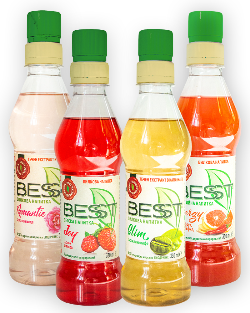
After looking at similar brands and how they marketed their products, I knew I had to propose an immersive experience that would relay the essence of the BESST Drinks brand - a clean, all-natural product developed through thorough research and with the consumer's well-being in mind. In order to ensure a professional, quality website, I had to photograph the products myself and edit the photographs to make them look as realistic and desirable as possible.
To really immerse the user into the world of BESST, I incorporated elements from the ingredients of the drinks, included custom Lottie animations to display the process of drinking from the bottle and added a soundtrack of chirping birds in a forest.
STEP 2: STYLE SCAPES
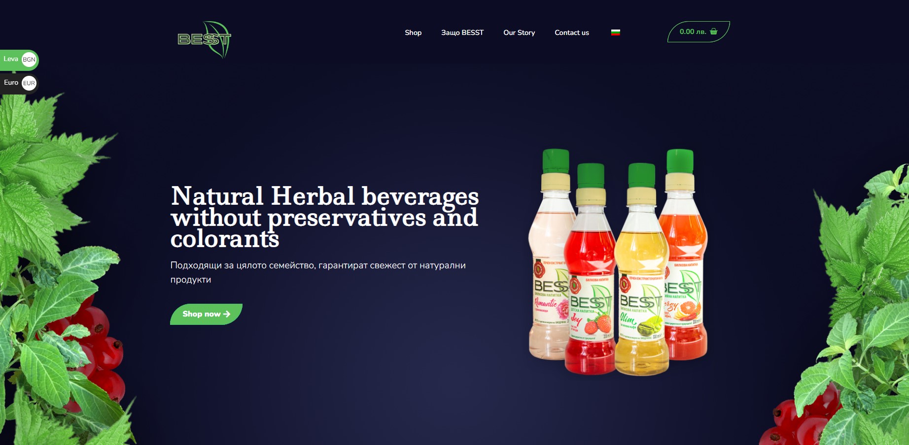
Stemming from the natural theme, I decided to keep green as the main color, but make it a more lively, energetic green, which would appeal to the younger consumers. To balance the brighter green, I picked a deep blue, which was natural and compatible with the "Balkan forest" look.
STEP 3: WIREFRAMES
Create a wireframe for the site pages, content and layout on each page. In order to better picture the website structure myself, I created wireframes with a very general map of text, image and other element positions. This served as my guide in the next stage of the design process and really helped me keep the user and client needs in mind the whole time.

STEP 4: DESIGN
In order to keep the website minimal yet engaging, I kept the texts to a minimum with only bried descriptive texts and larger headings, avoiding long paragraphs. Right at the top of the page, I wanted to include currency and language pickers as well as a basket button, which would lead to the e-commerce shop. I included the product right in the hero section, surrounded by natural elements that gave information about the drink's ingredients. To make the website a little more exciting than just a regular e-commerce site or marketing one-pager, I wanted to add animations that told a story. I decided to implement that tactic when displaying the process of opening the bottle.
I created custom animations in After Effects to make sure they were 100% authentic and on-brand and embedded them right into Elementor.
In order to make sure the information is viewed and processed correctly, It's crucial to use hierarchy in text - only one H1 per page, followed by an H2 in every section and smaller text for longer descriptions. In this particular website, I avoided long paragraphs and let the images and animations do the talking,
Rather than sticking to the usual grid design of e-commerce shops, I wanted to give each product more space on the page, especially since there are only four flavors to be displayed. Within each flavor's page, I made sure to include descriptions of ingredients and a place to leave a review, which in my opinion builds trust between the consumers and the brand.
STEP 5: DEVELOPMENT
Last but not least, came the development phase using Wordpress' Elementor. With the help of a developed I brought all my ideas to life and created a website I was proud of and the client loved.