Food Corner
COMPETITOR RESEARCH & USER PERSONAS
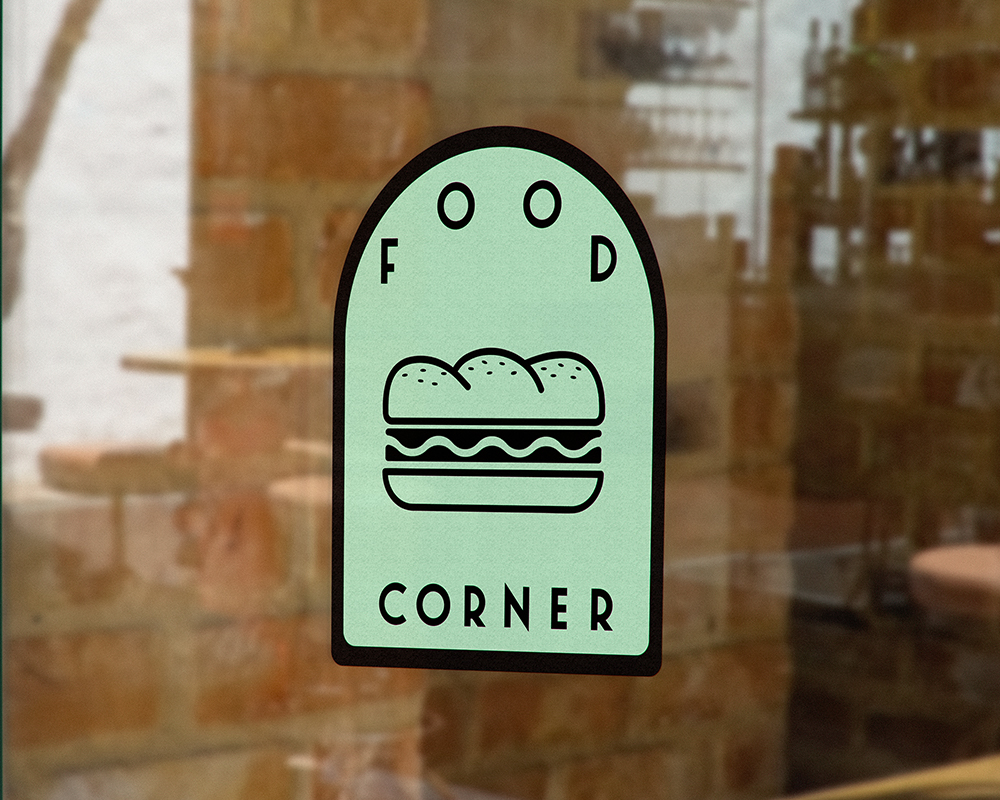
Before creating the logo for the Food Corner cafe, I had to look at how similar businesses did their branding. I wanted to present a clean, modern feel with soft colors and simple features. The clients requirements were that I use green and there is a symbol of some sort of finger food - preferably a sandwich. I complied and presented several options that complied to the client's brief, looked modern and young and some options I came up with in case they wanted to take a different direction once they saw it as a design.
LOGO DESIGN

BRANDING
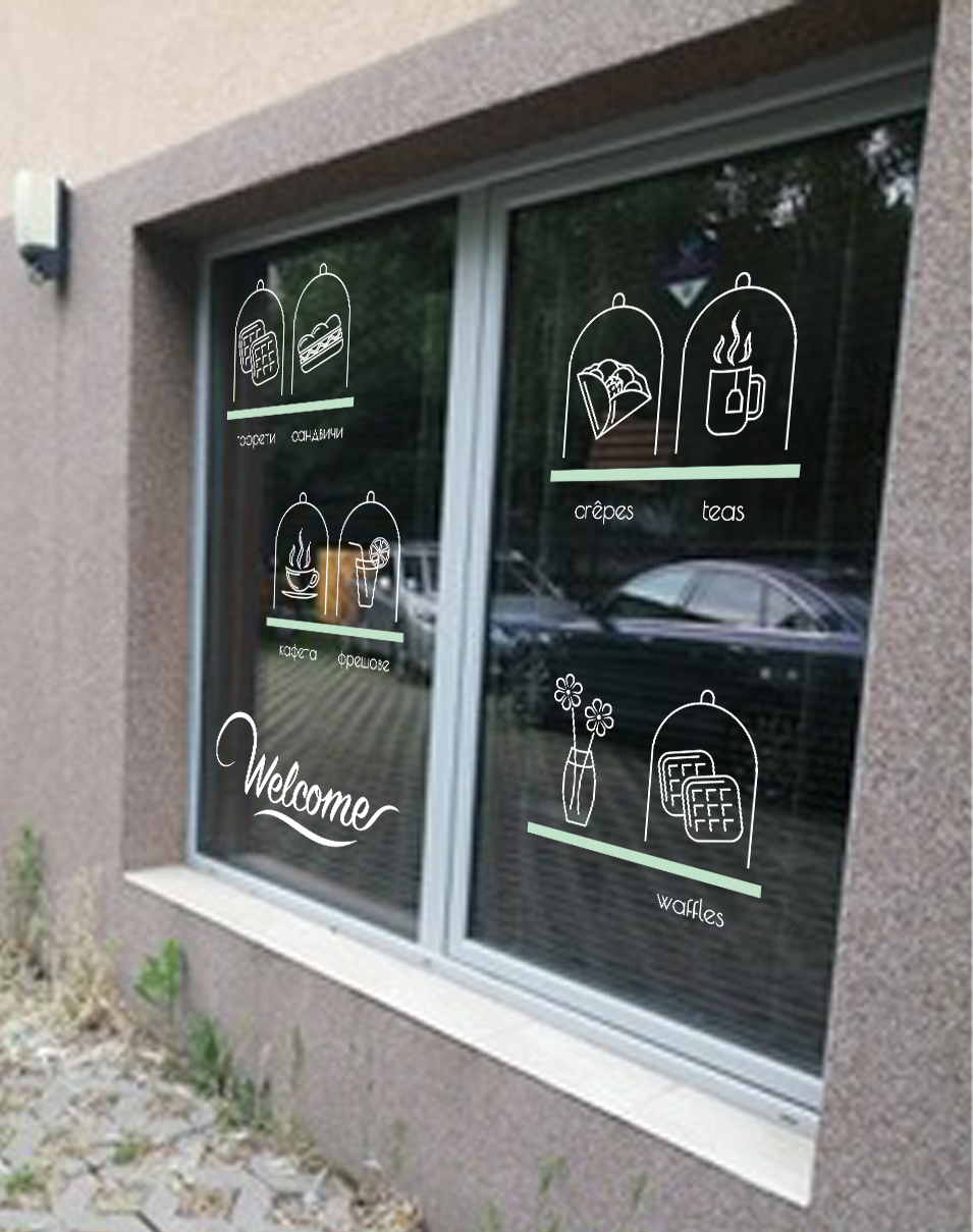
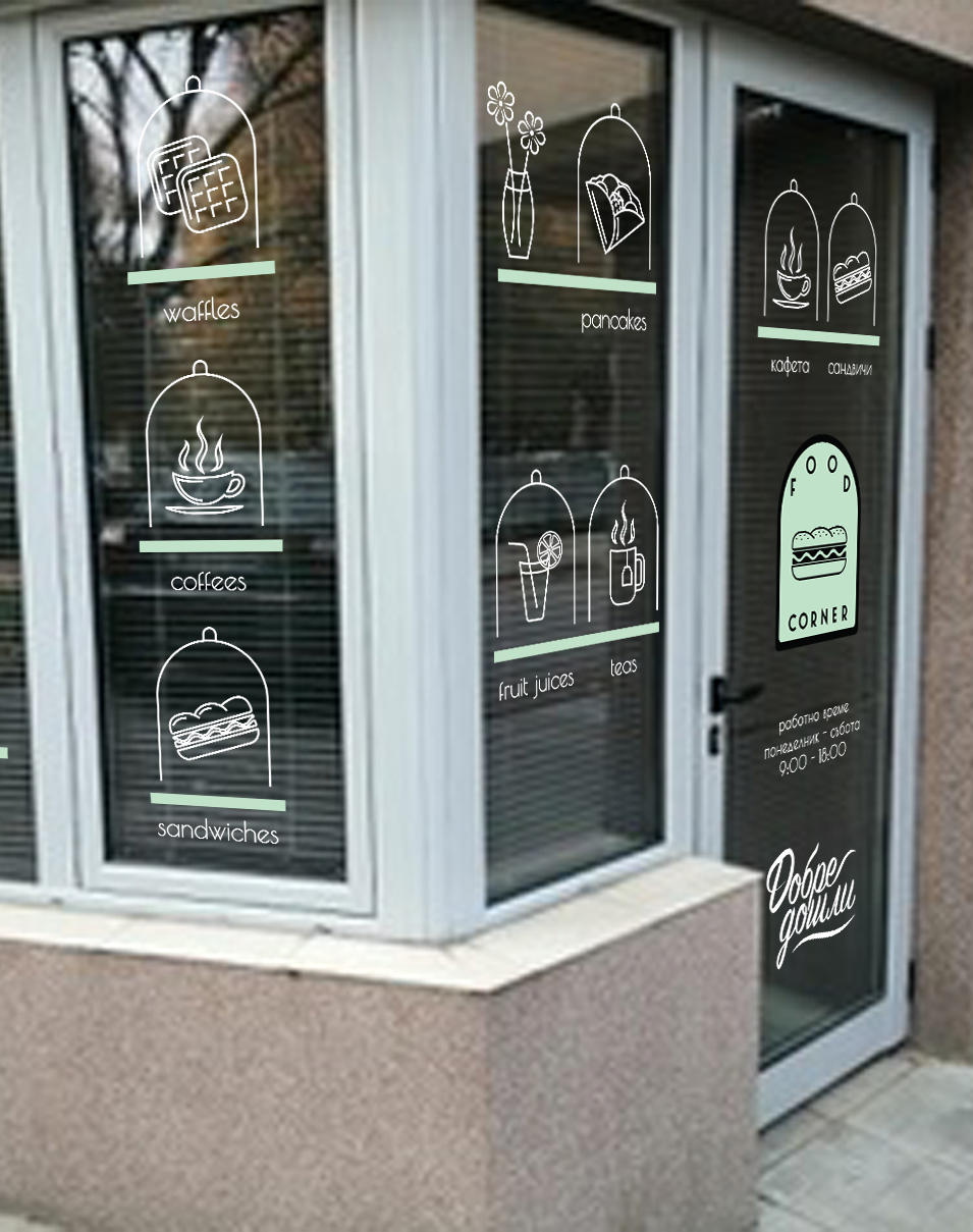
I created custom icons that were consistent with the style of the logo for each food and drink they wanted to showcase on the shop windows and put together a quick mockup using pictures I snapped at the location so the client would get a better idea of what the final product would look like.