Food Waste App
*Due to confidentiality concerns and the fact that the official redesign has not yet been released, I am unable to share images of my work for this client.
INTRODUCTION
My client is a Bulgarian app that fights food waste by allowing restaurants and shops to sell any leftovers at the end of each day instead of contributing to global food waste. It is also a chance for customers to get delicious surprise treats from their favorite eateries at a lower price while doing their part in reducing food waste.
PROJECT DURATION
October 2022 - June 2023
COLLABORATION
During the 8 months I worked with the team, we had multiple meetings to discuss stakeholder vision and goals for the redesign as well as technical constraints. They shared their plans for new functionalities and we discussed improvements and new ideas in order to achieve results that not only look good, but serve the purposes of the organization.
PROCESS AND BUILDING THE DESIGN SYSTEM
In order to give the founders a better idea of the kind of work I would do for their app, I created mockups for several screens using the existing app as a reference point. Based on those designs, they decided to hire me for the project. We had several meetings to discuss what their vision for the app functionalities was and new features and screens they wanted to add. I then began the redesign.
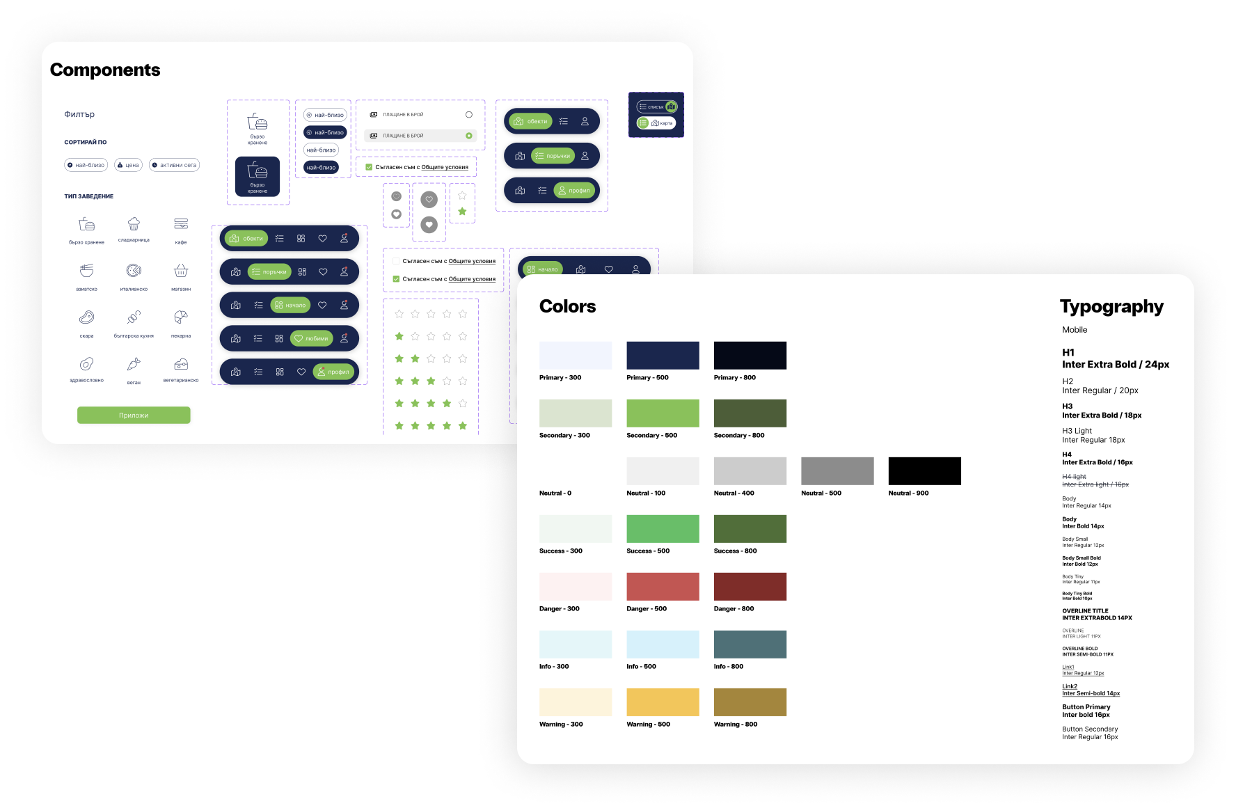
Firstly, I created the foundation of the design system - the style guide with the main colors and fonts for the app. I continued to expand the design system by adding the main components like buttons, the navigation menu, check boxes, toggles, etc.. As new screens were added, so were new components. This made it much easier to duplicate designs and ensure consistency across the app.
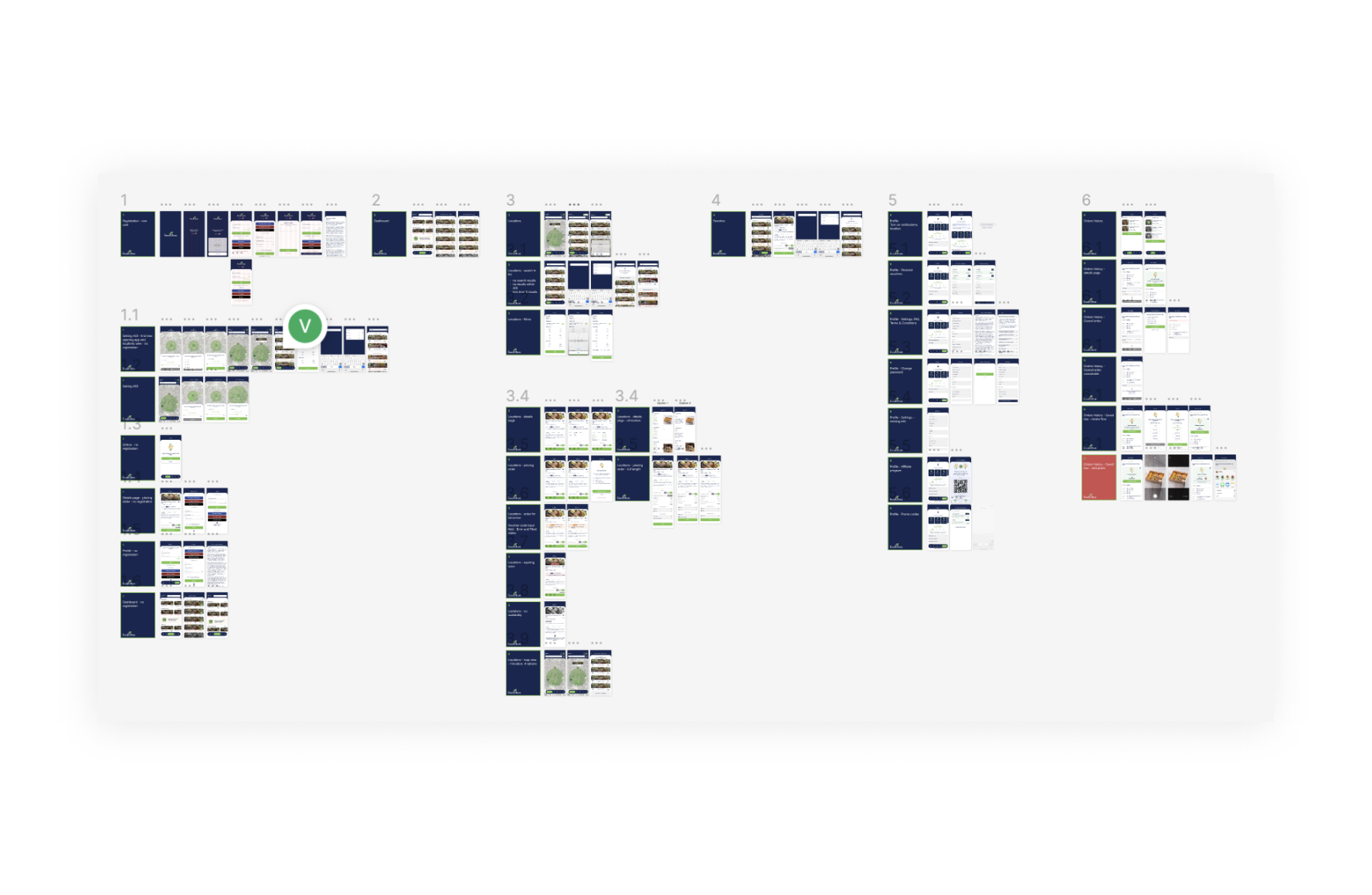
ORGANIZATION
After half a year of working on the redesign, there were quite a few screens and user flows. It was time to more clearly label and organize the designs based on the different menu pages and the user flows. This proved to be a much more effective way to both design future screens, make changes and improvements and also for the stakeholders to understand the design file.
IMPROVEMENTS
Frankly, the design and feedback process with this client ran very smoothly and there were no serious bumps in the road. We had meetings when necessary to sync on the latest updates or new features and discuss the designs. I took their needs into consideration and they took my professional advice on best practices (based on my experience and research).
- The main improvement I would make (and a quite important one, I would say) is including user research into the process. Due to my lack of experience at the start of the project and the subsequent shrinking of the budget, I relied on a very small sample of users (people in my direct vicinity) for feedback on clarity and usability. The users were my age and tech savvy, which is a large portion, but definitely not the complete scope of the target users of the app.
- In hindsight, when building the design system, I missed a crucial step, which later caused some confusion and inconsistencies. I didn't add spacing and I didn't set usage guidelines for each color and font. This increased my decision making time and led to a couple of cases of design inconsistencies that I had to go back and fix on my own time before a deadline.