Patient21
INTRODUCTION
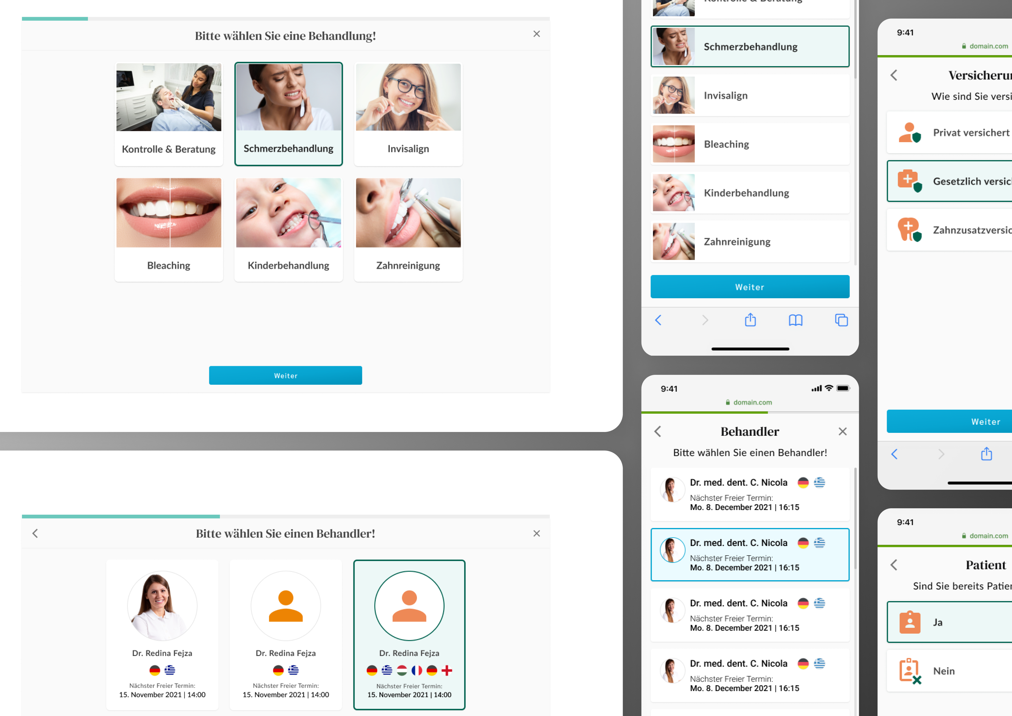
During my time at Patient21, I worked within an agile team with front- and back-end developers, tech lead and a project manager on patient-facing products such as clinic and company websites and the appointment booking tool Availy. In order to update the designs of the booking tool, we had to conduct moderated qualitative and quantitative user research to determine which aspects needed modification and how to improve both UX and UI in order to benefit users and achieve a higher conversion rate.
GOAL
Decrease drop-off rate at different stages of the appointment booking process and identify problem areas that confuse users and result in abandonment.
PROCESS
We began by reviewing recordings of real users interacting with the live tool on the clinic websites to identify recurring behavioural patterns. Combined with out observations and previous redesign ideas, we hypothesized that the main problem areas were the treatments list and the time slot selection page. Next, I decided to look into our main competitors and compare their user experience solutions.
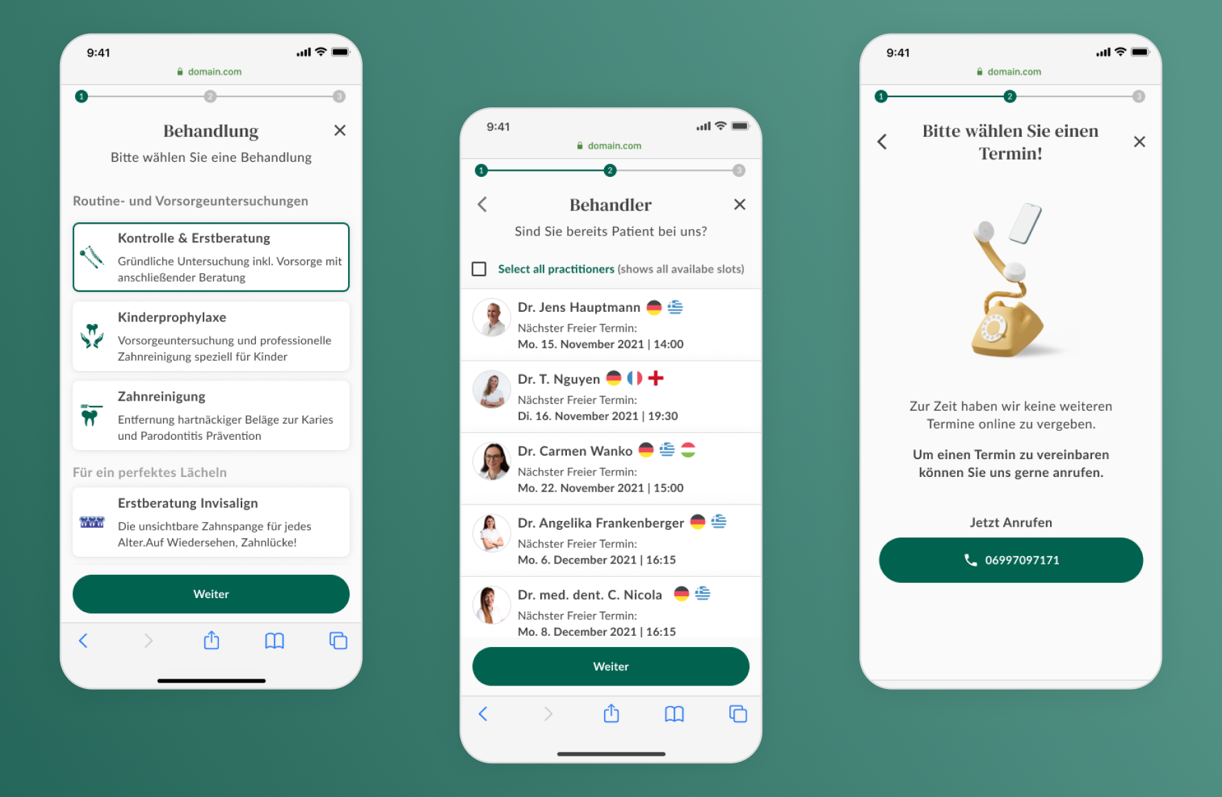
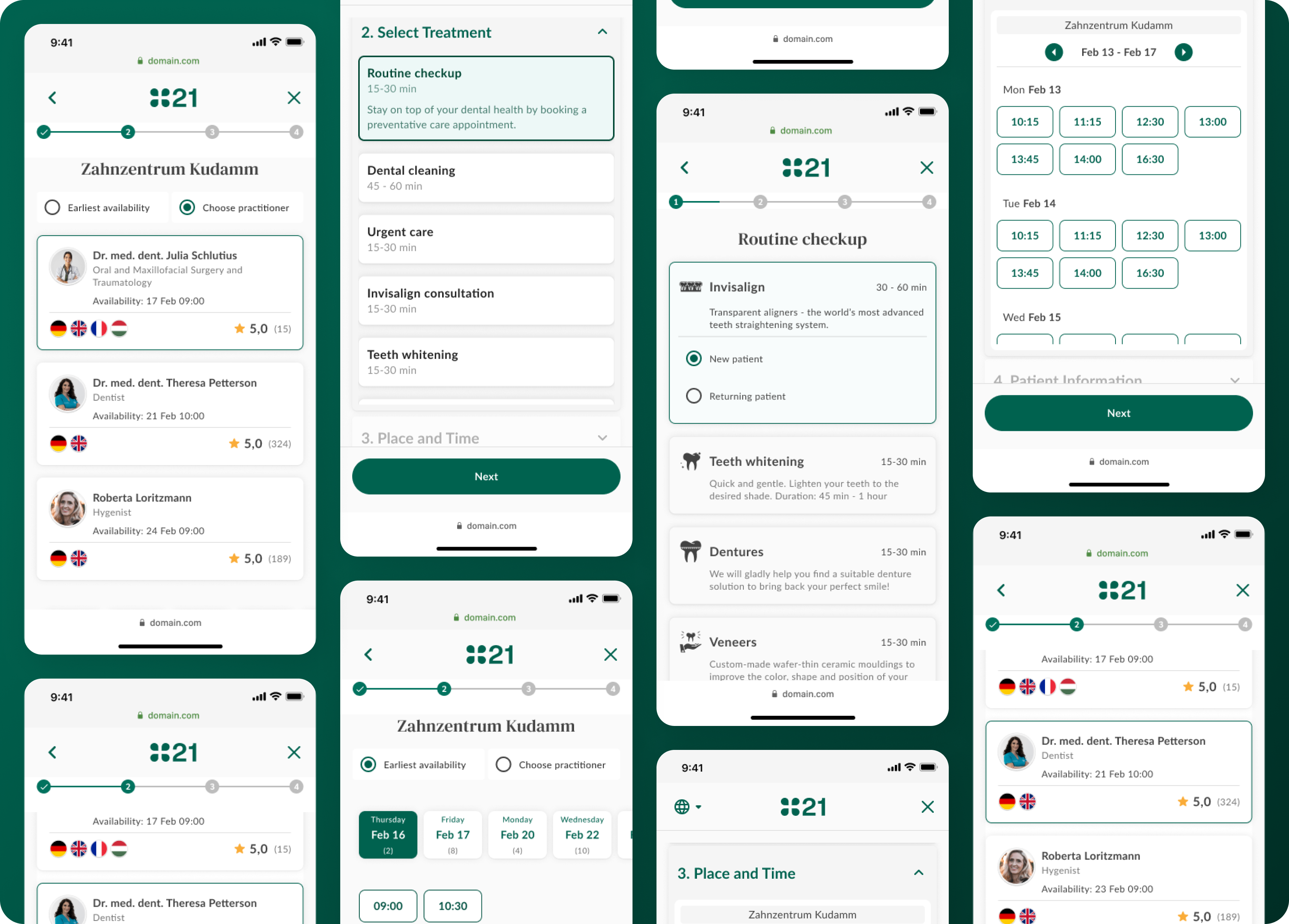
With the gathered information and deductions, I created three versions of the booking flow with three different treatment views and three different layouts to choose a time slot. We then conducted a moderated usability test by presenting the prototypes to five users who had not interacted with the tool before and asking them to think aloud as they completed the task of booking a time slot with a dentist. Five interviews were conduced in person with Bulgarian users and five were conducted online with native Germans. I moderated the interviews with questions I prepared in advance regarding functionality and design, gently reminding them about the think aloud protocol every so often. All the sessions were recorded. I then went back over both audio and screen recordings after each interview and filled in any information I may have missed along the way in a table format. I then used color coding to distinguish between positive, negative and neutral feedback.
Once the results were all recorded, I then grouped them based on the color and feature they referred to. This gave me a short, comprehensive list of positive and negative feedback that we could then directly apply to our booking tool.
KEY TAKEAWAYS
1. Usability benchmarking is key for design improvements
After beginning with the interviews, I realized all our redesigns were based solely on our own hypotheses and previous work from other designers. We were missing a benchmark that we could compare the new designs to. I returned to the initial five interviewees and conducted a second usability test with them using the existing design of the appointment booking tool. The results showed us that the time slot designs only needed to be tweaked and not completely redesigned, which deemed a lot of the work on the design of that step unnecessary.
2. Recruit real users for realistic results without bias
The second issue was that all our subjects were employees of the company. They hadn't used the booking tool before, but they were familiar with the work the company did, which gave them an advantage the average user would not have. Unfortunately there was no established process for recruiting subjects for usability testing other than going into clinics and interviewing willing patients. Due to geographical obstacles, I was unable to conduct such interviews and relied on results from another team based in Berlin.
3. Record interviews and go back over the recordings as soon as possible
I found this extremely helpful since the interviews took on average about 30 to 40 minutes and even though, I was conducting them, I still could not remember all the details once the interview was over. Going back over the recordings allowed me to fill in the gaps and recall any other important insights I might have missed during the interviews.
4. Have a second set of eyes and ears at the interviews
Due to a pile-up in backlog, my project manager was unable to attend the first five interviews, so I conducted them alone and had to ask questions, take notes and pay attention to user behaviour and reactions. Having a helping hand, someone else who could watch out for any reactions or gestures and take notes while I focused on putting the interviewees at ease and guiding them through the booking process with questions and prompts, was a game changer.
5. Track and keep record of key results before and after redesign
Unfortunately records for the key metrics we were targeting were not conclusive when the redesign process was set to begin. Therefore it made it difficult to determine whether the design changes would make enough of a difference to make the time and work we were spending on them worthwhile. This made accountability difficult and affected the team's motivation and sense of purpose.
6. Coordinate closely with designers from teams working on simillar products
This one seems obvious, but it's so easy to get caught up in the design process and forget to check in with teammates. This was a good example of why having exclusive weekly standups with other designers is helpful. Keeping tabs on each others' work helped us identify when we were working on similar processes and collaborate to create the best user experience while keeping the user interface consistent throughout company products.