sustainabuddy
IDEA GENERATION
I wanted to create a relevant, innovative product that would not only be user-friendly and look nice, but also benefit society and the environment. Proper waste disposal, air quality and environmental awareness are lacking to a large extent here in Bulgaria. My conceptual App aims to support people from all walks of life, all ages and all technological abilities to do right by the environment by recycling, separating their waste, shopping more sustainably and generally leading a more sustainable way of life.
COMPETITOR RESEARCH
I looked at all available sustainability-promoting apps and websites and found that no single app offered a one-stop shop for all sustainability needs and questions. For this reason, I turned to concept designs, apps with a similar target audience and clean, user-friendly style and design to go off of as references and best practices.
USER GROUP
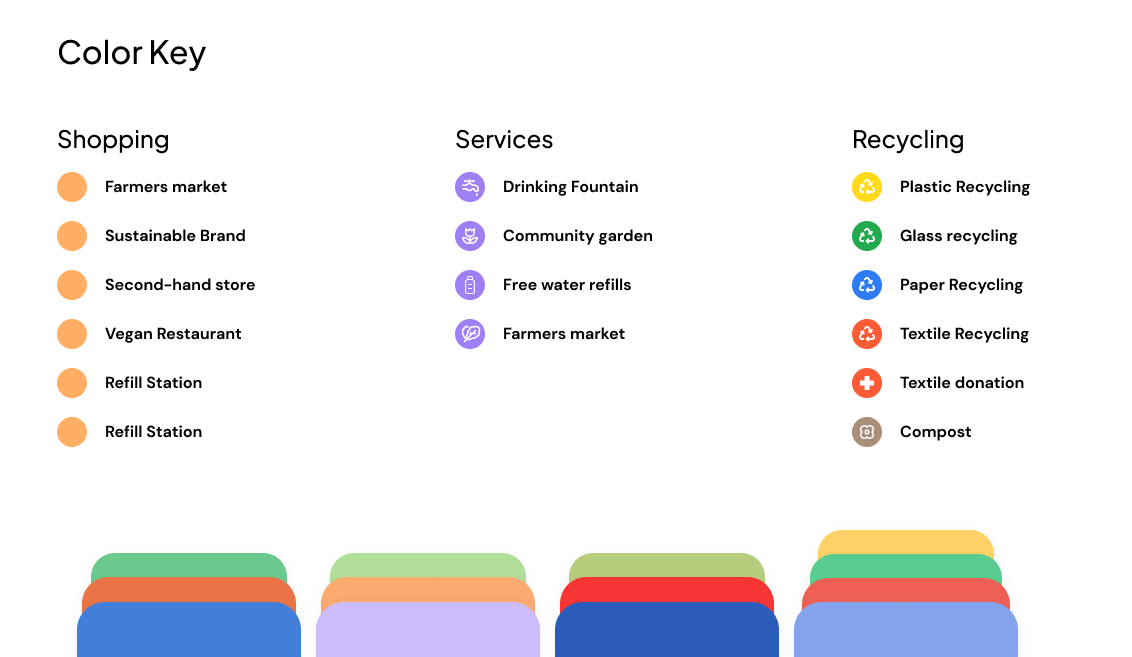
My app's target audience are mostly young, tech savvy people, interested in preserving the environment by doing their part. I picked my color palette based on my target - lively, yet not too vivid in order to appeal to a wider range of ages, genders and interests. Keeping in mind the target audience's main pain points - finding the right place to recycle various materials, finding information about environmental campaigns and regulations, a directory of all sustainable brands and no-plastic restaurants and stores.
STYLE GUIDE
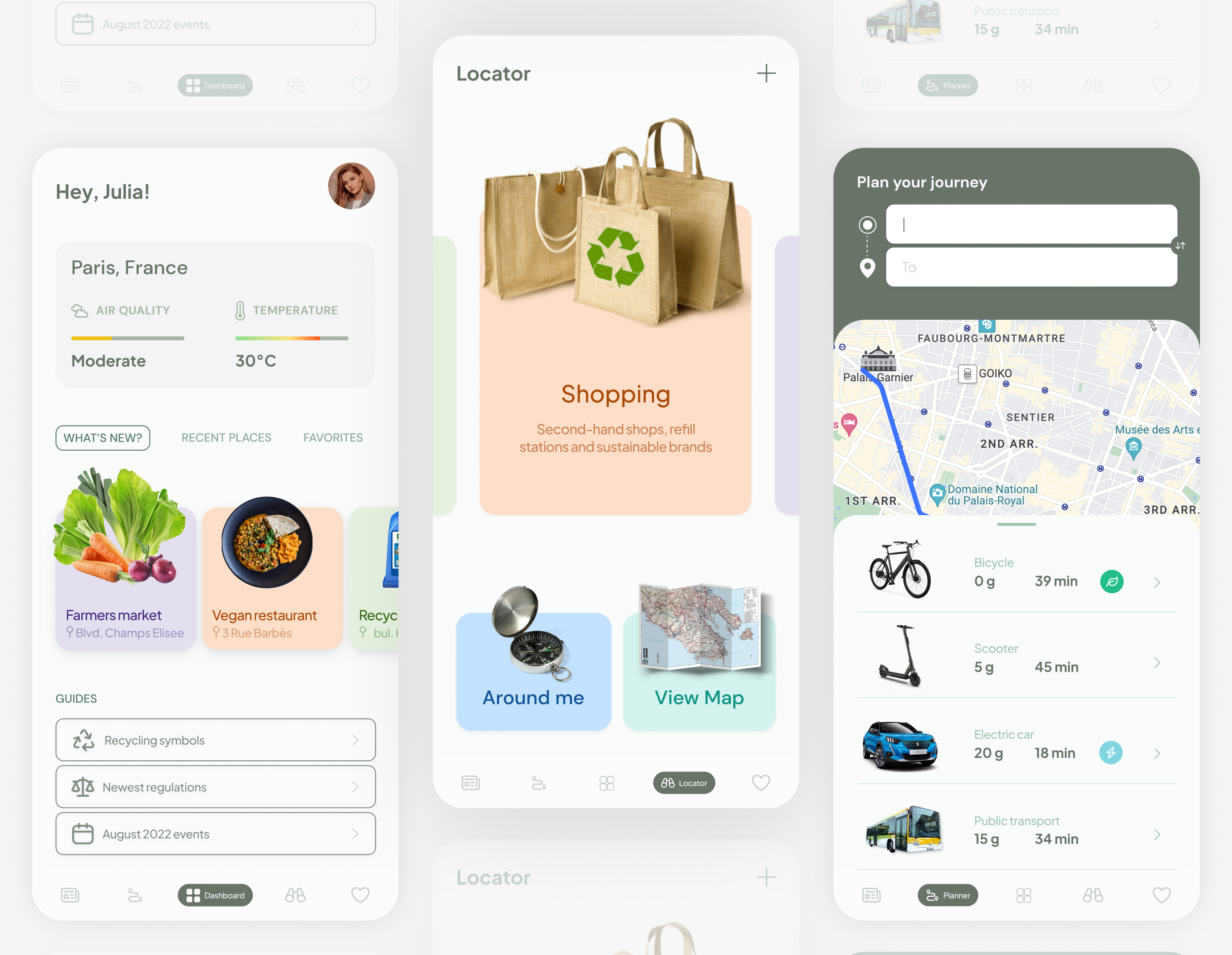
I used pastel colors to avoid overwhelming the eye and keeping the user's attention on the most important features. Using a green as the main UI color, I allowed myself to add some more color to distinguish between the main categories and make the app more friendly and welcoming. I still wanted to keep the design minimal and avoid too much text, elements, icons that would make it seem more complicated or unnecessarily confuse users - especially those from older generations who are not used to being constantly bombarded with information. For this reason, I picked a reasonable sans serif font that would be easy to read and allowed variety when creating a hierarchy.

DESIGN SYSTEM
In Figma, I created components for all the repetitive elements and those that I wanted to add interactions to. I made sure to use similar forms throughout to maintain a coherent look and feel and avoid crowding the screen with different shapes. Instead of adding icons for everything, I decided to use cutout images to create a more modern and slick look. I incorporated elements and positioning similar to other iOS apps to make onboarding easier for new users. Referring to other popular apps like Google Maps, Revolut, Facebook and Instagram, I made not of best practices when presenting categories of products, lists and journey planning.
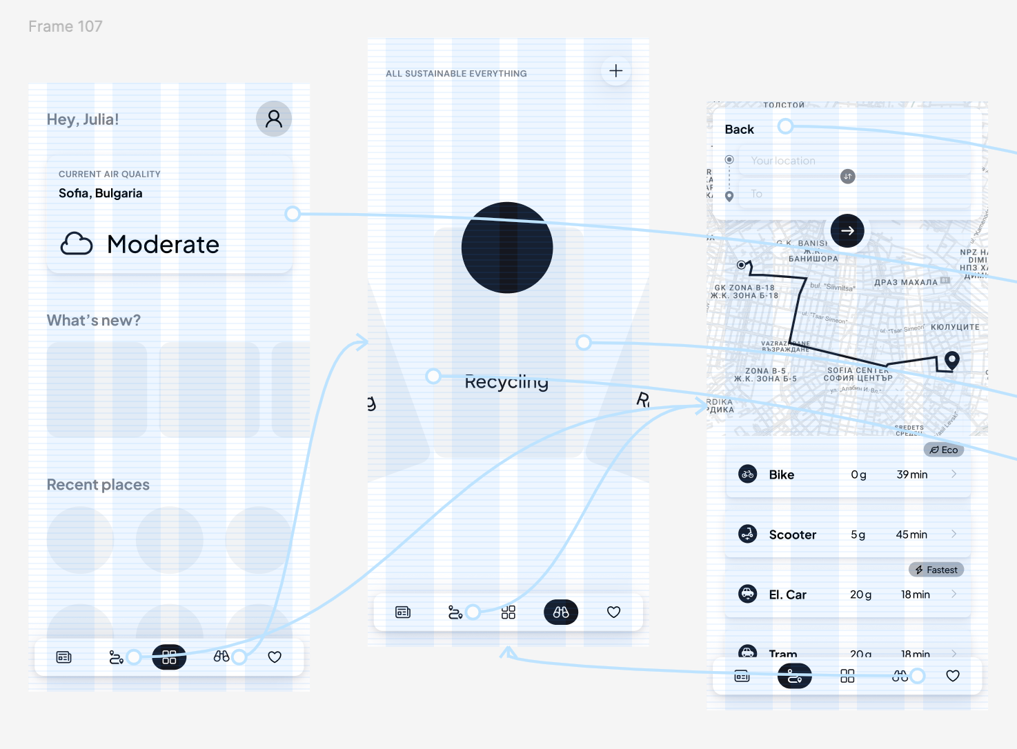
WIREFRAMING
In order to map out all the features I wanted to include and position them in the most logical way, I started with a rough draft of where each element would be positioned on the screens and quickly prototyped to see if the flow made sense, if anything was missing or unnecessary.
DESIGN
The final step was dressing the wireframe in the brand colors, adding images, icons and interactions. As this is still a work in progress, I have included the current designs of three screens - the rest pending. So stay tuned to see the new features of my sustainability buddy.