umay

Logo Design
The umay logo was inspired by the origin of the brand name, umay, the goddess of fertility. Combining that with the nature of the product, a menstrual cup, the logo is an abstract form representing a female uterus, which also symbolizes the female body.

The client chose a simple, hand lettered font as a way of reflecting the authenticity and ecological side of the brand - plastic-free packaging and a reusable sanitary product, which reduces, if not completely eradicates, the need for single-use pads and tampons.

Icon Design
Going off of the logo design, I continued with the minimal, hand-drawn look to enhance the raw feel of the product packaging and to make sure all visuals were coherent and on-brand.


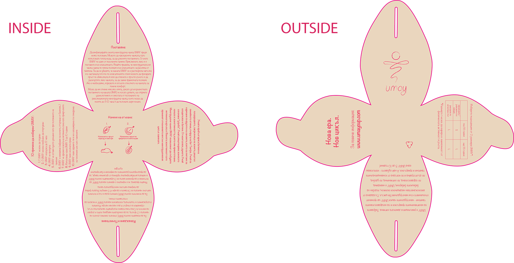
Packaging
Umay’s boxes are made from recyclable paper without colorants. The instructions are printed directly onto the packaging in order to avoid the use of additional paper.
The unique form of the box presented an interesting challenge when creating the packaging design. I created a custom frame in Illustrator, which served as a guideline for the position and size of the text and illustrations.